A Theme Changer is a valuable web functionality that enables users to switch between various color schemes or visual themes on a website. The implementation of this feature involves the use of HTML, CSS, and JavaScript.
HTML is responsible for defining the structure of the webpage, while CSS is responsible for its visual styling, including the layout, colors, and fonts. On the other hand, JavaScript adds interactivity to the webpage and manages the theme switching functionality.
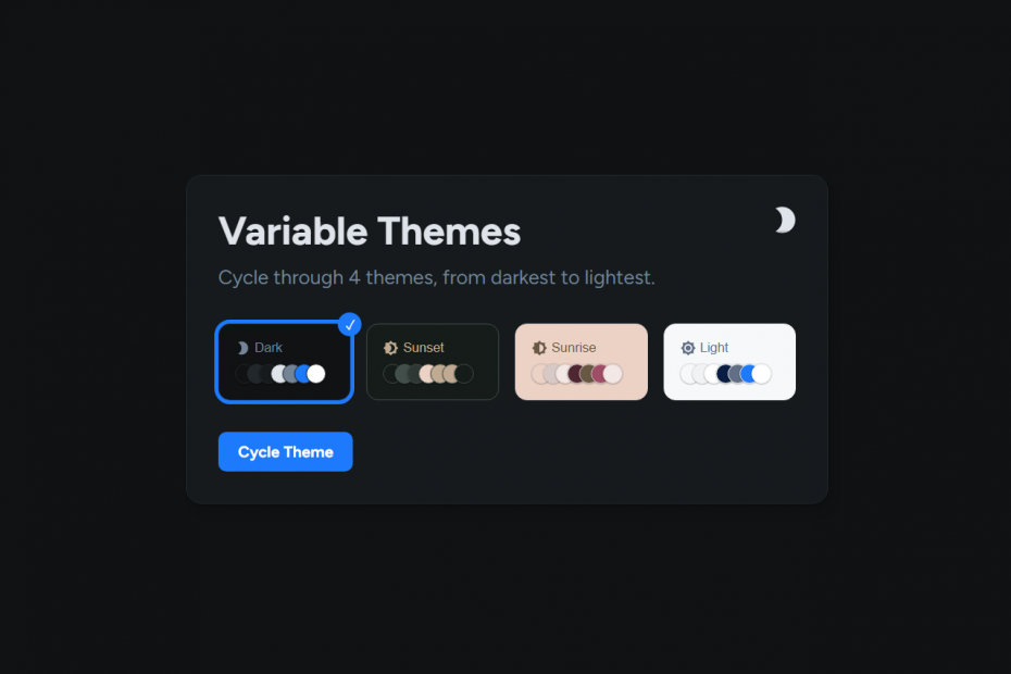
The Theme Changer feature works by displaying a list of theme options that users can choose from. When a user selects a new theme, the JavaScript code modifies the CSS styles of the webpage in real-time, resulting in a visual theme that reflects the user’s selection.
This feature is useful for websites that aim to offer a personalized experience for users and allow them to customize their viewing experience. It can also be especially helpful for individuals who have visual impairments or are sensitive to certain colors and need to modify the website to meet their specific needs.
Demo
I would recommend you don’t just copy and paste the code, just look at the code and type by understanding it.
HTML Code – Starter Tamplate
<!doctype html>
<html lang="en">

<head>
    <!-- Required meta tags -->
    <meta charset="utf-8">
    <meta name="viewport" content="width=device-width, initial-scale=1">

    <!-- CSS -->
    <link rel="stylesheet" href="style.css">

    <title>Varibale Themes Changer - Anoncodes</title>
</head>

<body>
    <!-- Further code here -->

     <script src="script.js"></script>
</body>

</html>
Paste the below code in your <body> tag.
.c-card
	button.c-theme#themePicker
	h1.c-card__title Variable Themes
	p.c-card__description Cycle through 4 themes, from darkest to lightest.
	.c-theme-grid#themeGrid
	a.c-button#button Cycle Theme
CSS Code
Create a file style.css and paste the code below.
:root {
	--dark-bg: #101214;
	--dark-border: #22272B;
	--dark-surface: #161A1D;
	--dark-text-primary: #DEE4EA;
	--dark-text-secondary: #738496;
	--dark-primary: #1D7AFC;
	--dark-text-inverse: #FFFFFF;
	--sunset-bg: #151c19;
	--sunset-border: #424f4a;
	--sunset-surface: #2f3834;
	--sunset-text-primary: #ecd2c5;
	--sunset-text-secondary: #C0AB92;
	--sunset-primary: #C0AB92;
	--sunset-text-inverse: #151c19;
	--sunrise-bg: #ecd2c5;
	--sunrise-border: #d7c9c6;
	--sunrise-surface: #f3e8e5;
	--sunrise-text-primary: #4f2733;
	--sunrise-text-secondary: #685844;
	--sunrise-primary: #a04d66;
	--sunrise-text-inverse: #f3e8e5;
	--light-bg: #F7F8F9;
	--light-border: #F1F2F4;
	--light-surface: #FFFFFF;
	--light-text-primary: #091E42;
	--light-text-secondary: #626F86;
	--light-primary: #1D7AFC;
	--light-text-inverse: #FFFFFF;
	--bg: var(--dark-bg);
	--border: var(--dark-border);
	--surface: var(--dark-surface);
	--text-primary: var(--dark-text-primary);
	--text-secondary: var(--dark-text-secondary);
	--primary: var(--dark-primary);
	--text-inverse: var(--dark-text-inverse);
}

*, *:before, *:after {
	box-sizing: border-box;
}

html {
	box-sizing: inherit;
	font-size: 62.5%;
}

html,body {
	margin: 0;
	padding: 0;
	width: 100%;
	height: 100%;
}

body {
	font-size: 1.6rem;
	font-family: 'Figtree', system-ui, sans-serif;
	display: flex;
	align-items: center;
	justify-content: center;
	padding: 1.2rem;
	background: var(--bg);
	color: var(--text-secondary);
}

.c-card {
	width: 100%;
	max-width: 650px;
	border: 1px solid var(--border);
	border-radius: 1.6rem;
	padding: 3.2rem;
	background: var(--surface);
	position: relative;
	box-shadow: 0.3px 0.5px 0.7px rgba(black, 0.08),
    0.8px 1.6px 2px -0.8px rgba(black, 0.08),
    2.1px 4.1px 5.2px -1.7px rgba(black, 0.08),
    5px 10px 12.6px -2.5px rgba(black, 0.08);
	&__title {
		margin: 0 0 .8rem;
		padding: 0;
		line-height: 1.2;
		font-size: 4rem;
		color: var(--text-primary);
	}
	&__description {
		margin: 0;
		padding: 0;
		line-height: 150%;
		font-size: 2rem;
		color: var(--text-secondary);
	}
}

.c-button {
	display: inline-flex;
	padding: 1.2rem 2rem;
	background: var(--primary);
	border-radius: .8rem;
	line-height: 1;
	cursor: pointer;
	color: var(--text-inverse);
	font-weight: 700;
	user-select: none;
	position: relative;
	transition: all 120ms ease-out;
	&:hover, &:focus {
		outline: none;
		transform: scale(1.03);
	}
}

.c-theme {
	position: absolute;
	top: 2.4rem;
	right: 2.4rem;
	width: 4rem;
	height: 4rem;
	cursor: pointer;
	display: inline-block;
	overflow: hidden;
	padding: 0;
	margin: 0;
	background: transparent;
	color: var(--text-primary);
	border: 1px solid transparent;
	border-radius: 0.8rem;
	padding: .4rem;
	transition: all 120ms ease-out;
	&:hover, &:focus {
		border-color: var(--border);
	}
	&:after, &:before {
		content: '';
		position: absolute;
		z-index: 10;
	}
	&:after {
		top: 0;
		left: 0;
		right: 0;
		height: .8rem;
		background: linear-gradient(to bottom, var(--surface), transparent);
	}
	&:before {
		bottom: 0;
		left: 0;
		right: 0;
		height: .8rem;
		background: linear-gradient(to top, var(--surface), transparent);
	}
	&:focus {
		outline: none;
	}
	&__grid {
		position: relative;
		width: 3.2rem;
		transition: all 240ms ease-out;
	}
	svg {
		width: 3.2rem;
		height: 3.2rem;
		&:focus {
			outline: none;
		}
	}
}

.c-box {
	display: flex;
	width: 100%;
	flex-direction: column;
	background: var(--bg);
	color: var(--text-secondary);
	position: relative;
	padding: 1.6rem;
	border-radius: 1.2rem;
	border: 1px solid var(--border);
	user-select: none;
	cursor: pointer;
	transition: all 120ms ease-out;
	&:hover, &:focus {
		transform: scale(1.03);
	}
	&__title {
		display: flex;
		align-items: center;
		width: 100%;
	}
	&__icon {
		width: 1.6rem;
		height: 1.6rem;
		margin-right: 0.4rem;
	}
	&__swatches {
		display: flex;
		flex-wrap: wrap;
		margin-top: .8rem;
	}
	&--active {
		outline: 4px solid var(--primary);
		&:after {
			content: '✓';
			position: absolute;
			top: -1.2rem;
			right: -1.2rem;
			height: 2.4rem;
			width: 2.4rem;
			background: var(--primary);
			border-radius: 999px;
			color: var(--text-inverse);
			display: inline-flex;
			align-items: center;
			justify-content: center;
		}
	}
}

.c-swatch {
	width: 2rem;
	height: 2rem;
	display: inline-block;
	border-radius: 999px;
	border: 1px solid var(--border);
	margin-right: -.8rem;
	box-shadow: 0px 1px 1px rgba(black, 0.12), 0px 0px 0px 1px rgba(black, 0.08);
}

.c-theme-grid {
	display: grid;
	grid-template-columns: repeat(4, 1fr);
	grid-gap: 1.6rem;
	margin: 3.2rem 0;
	@media(screen and max-width: 700px) {
		grid-template-columns: repeat(2, 1fr);
	}
}
Javascript Code
Create a file index.js and paste the code below.
console.clear()

const themes = ['dark', 'sunset', 'sunrise', 'light'];
let count = 0;
const themePicker = document.getElementById('themePicker');
const themeList = document.getElementById('themeGrid');

// Change the CSS variables on the root element, depending on the curent theme
const changeTheme = (theme) => {

	if(count < 3) {
		count += 1;
	} else {
		count = 0
	}

	document.documentElement.style.setProperty('--bg', `var(--${theme}-bg)`);
	document.documentElement.style.setProperty('--border', `var(--${theme}-border)`);
	document.documentElement.style.setProperty('--surface', `var(--${theme}-surface)`);
	document.documentElement.style.setProperty('--text-primary', `var(--${theme}-text-primary)`);
	document.documentElement.style.setProperty('--text-secondary', `var(--${theme}-text-secondary)`);
	document.documentElement.style.setProperty('--primary', `var(--${theme}-primary)`);
	document.documentElement.style.setProperty('--text-inverse', `var(--${theme}-text-inverse)`);

	const themeGrid = themePicker.querySelector('.c-theme__grid')

	if(themeList.querySelector('.c-box--active')) {
		themeList.querySelector('.c-box--active').classList.remove('c-box--active')
	}

	themeList.querySelectorAll('.c-box').forEach(item => {
		if(item.dataset.theme === theme) {
			item.classList.add('c-box--active')
		}
	})

	switch(theme) {
		case theme = 'dark':
			themeGrid.style.top = '0'
			break;
		case theme = 'sunset':
			themeGrid.style.top = '-3.6rem'
			break;
		case theme = 'sunrise':
			themeGrid.style.top = '-7.1rem'
			break;
		case theme = 'light':
			themeGrid.style.top = '-10.7rem'
			break;
	}
}

// Define Icons
const darkIcon = `<svg fill="currentColor" aria-hidden="true" viewBox="0 0 24 24" tabindex="-1" title="Dark"><path d="M10 2c-1.82 0-3.53.5-5 1.35C7.99 5.08 10 8.3 10 12s-2.01 6.92-5 8.65C6.47 21.5 8.18 22 10 22c5.52 0 10-4.48 10-10S15.52 2 10 2z"></path></svg>`

const sunsetIcon = `<svg fill="currentColor" aria-hidden="true" viewBox="0 0 24 24" tabindex="-1" title="Sunset"><path d="M20 8.69V4h-4.69L12 .69 8.69 4H4v4.69L.69 12 4 15.31V20h4.69L12 23.31 15.31 20H20v-4.69L23.31 12 20 8.69zM12 18c-.89 0-1.74-.2-2.5-.55C11.56 16.5 13 14.42 13 12s-1.44-4.5-3.5-5.45C10.26 6.2 11.11 6 12 6c3.31 0 6 2.69 6 6s-2.69 6-6 6z"></path></svg>`

const sunriseIcon = `<svg fill="currentColor" aria-hidden="true" viewBox="0 0 24 24" tabindex="-1" title="Sunrise"><path d="M20 15.31 23.31 12 20 8.69V4h-4.69L12 .69 8.69 4H4v4.69L.69 12 4 15.31V20h4.69L12 23.31 15.31 20H20v-4.69zM12 18V6c3.31 0 6 2.69 6 6s-2.69 6-6 6z"></path></svg>`

const lightIcon = `<svg fill="currentColor" aria-hidden="true" viewBox="0 0 24 24" tabindex="-1" title="Light"><path d="M20 8.69V4h-4.69L12 .69 8.69 4H4v4.69L.69 12 4 15.31V20h4.69L12 23.31 15.31 20H20v-4.69L23.31 12 20 8.69zM12 18c-3.31 0-6-2.69-6-6s2.69-6 6-6 6 2.69 6 6-2.69 6-6 6zm0-10c-2.21 0-4 1.79-4 4s1.79 4 4 4 4-1.79 4-4-1.79-4-4-4z"></path></svg>`

// Content and click function for the theme picker
themePicker.innerHTML = `
	<div class="c-theme__grid">
		${darkIcon}
		${sunsetIcon}
		${sunriseIcon}
		${lightIcon}
	</div>
`

themePicker.onclick = () => {
	changeTheme(themes[count])
}

document.getElementById('button').onclick = () => {
	changeTheme(themes[count])
}

const capitalized = (word) => {
	return word.charAt(0).toUpperCase() + word.slice(1)
}

themes.forEach((theme, i) => {
	let box = document.createElement('button');
	box.dataset.theme = theme
	box.onclick = () => {
		changeTheme(themes[i])
	}
	box.classList = 'c-box';
	box.style.setProperty('--bg', `var(--${theme}-bg)`);
	box.style.setProperty('--border', `var(--${theme}-border)`);
	box.style.setProperty('--surface', `var(--${theme}-surface)`);
	box.style.setProperty('--text-primary', `var(--${theme}-text-primary)`);
	box.style.setProperty('--text-secondary', `var(--${theme}-text-secondary)`);
	box.style.setProperty('--primary', `var(--${theme}-primary)`);
	box.style.setProperty('--text-inverse', `var(--${theme}-text-inverse)`);

	const iconRender = (theme) => {
		switch(theme) {
			case theme = 'dark':
				return darkIcon
				break;
			case theme = 'sunset':
				return sunsetIcon
				break;
			case theme = 'sunrise':
				return sunriseIcon
				break;
			case theme = 'light':
				return lightIcon
				break;
		}
	}

	box.innerHTML = `
		<div class="c-box__title">
			<span class="c-box__icon">
				${iconRender(theme)}
			</span>
			<label>${capitalized(theme)}</label>
		</div>
		<div class="c-box__swatches">
			<span class="c-swatch" style="background: var(--bg)" title="bg"></span>
			<span class="c-swatch" style="background: var(--border)" title="border"></span>
			<span class="c-swatch" style="background: var(--surface)" title="surface"></span>
			<span class="c-swatch" style="background: var(--text-primary)" title="text-primary"></span>
			<span class="c-swatch" style="background: var(--text-secondary)" title="text-secondary"></span>
			<span class="c-swatch" style="background: var(--primary)" title="primary"></span>
			<span class="c-swatch" style="background: var(--text-inverse)" title="text-inverse"></span>
		</div>
	`
	themeList.appendChild(box)
})

changeTheme(themes[0])
Written By : @anoncodes
Code Credit : @ryanparag