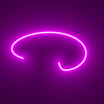
Rotating text using HTML and CSS is an engaging and dynamic way to enhance your website. By utilizing CSS animations and transforms, you can create a smooth rotation effect for text, resulting in an appealing visual element.
To implement this effect, begin by creating a container element like a <div> and adjust its dimensions to accommodate the rotating text. Inside the container, insert a <span> element to represent the text you wish to rotate.
To style the text, use CSS to define the desired font, size, color, and other visual properties for the <span> element.
To enable the rotation effect, utilize CSS animations and transforms. Generate a keyframe animation with @keyframes, specifying the rotation angle at various points in time. Then, apply this animation to the <span> element using the animation property.
Consider the following example of CSS code:
Demo
I would recommend you don’t just copy and paste the code, just look at the code and type by understanding it.
HTML – Starter Template
<!doctype html>
<html lang="en">

<head>
    <!-- Required meta tags -->
    <meta charset="utf-8">
    <meta name="viewport" content="width=device-width, initial-scale=1">

    <!-- CSS -->
    <link rel="stylesheet" href="style.css">

    <title>Rotating Text Using HTML & CSS- Anoncodes</title>
</head>

<body>
    <!-- Further code here -->

     <script src="script.js"></script>
</body>

</html>
Paste the below code in your <body> tag.
<div class="rotate">
  <div></div>
  <div></div>
  <div></div>
  <div></div>
  <div></div>
  <div></div>
  <div></div>
  <div></div>
  <div></div>
  <div></div>
  <div></div>
  <div></div>
  <div></div>
  <div></div>
  <div></div>
  <div></div>
  <div></div>
  <div></div>
  <div></div>
  <div></div>
  <div></div>
  <div></div>
  <div></div>
  <div></div>
  <div></div>
  <div></div>
  <div></div>
  <div></div>
  <div></div>
  <div></div>
  <div></div>
  <div></div>
  <div></div>
  <div></div>
  <div></div>
  <div></div>
  <div></div>
  <div></div>
  <div></div>
  <div></div>
  <div></div>
  <div></div>
</div>
CSS Code
Create a file style.css and paste the code below.
@import url('https://fonts.googleapis.com/css2?family=Lobster&display=swap');

*, *::before, *::after {
    padding: 0;
    margin: 0 auto;
    box-sizing: border-box;
}

body {
  font-family: 'Lobster', cursive;
  background-color: #000;
  color: #fff;
  min-height: 100vh;
  display: grid;
  place-items: center;
}

$duration: 4s;

.rotate {
  position: relative;
  color: #ff0099;
  font-size: 118px;
  filter: blur(2px) contrast(4);

  & > div {
    position: absolute;
    width: var(--size); height: var(--size);
    background-color: #000;
    transform: translate(-50%, -50%);
    border-radius: 50%;
    overflow: hidden;
    animation: twist $duration var(--delay) infinite ease-in-out;

    &::after {
      content: 'Anon';
      position: absolute;
      left: 50%; top: 50%;
      transform: translate(-50%, -50%);
    }

    @keyframes twist {
      0% { transform: translate(-50%, -50%) rotateZ(0deg); }
      50%, 100% { transform: translate(-50%, -50%) rotateZ(360deg); }
    }

    $count: 42;
    @for $i from 0 to $count {
      &:nth-child(#{$i + 1}) {
        --size: #{($count - $i) * 7px};
        --delay: #{($duration * 0.5) / $count * ($count - $i)};
      }
    }
  }
}
Written By : @anoncodes
Code Credit : @amit_sheen
Hope you find this post helpful 💖👀
Show Some Love and Support On These Social Media💖