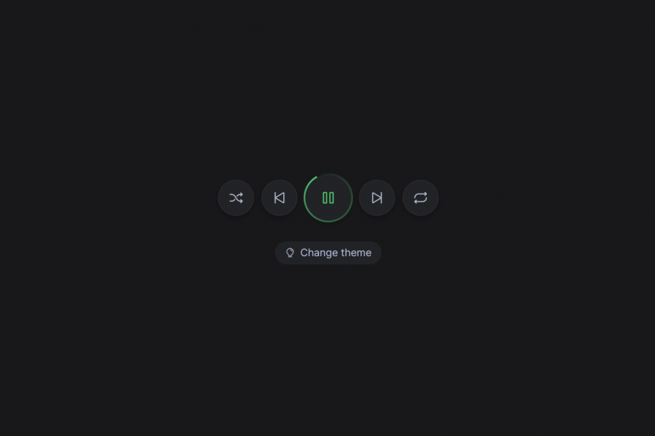
A play-pause button is a user interface element commonly used in multimedia applications and websites. It enables users to control the playback of media such as audio or video. The button usually has two states, a “play” state and a “pause” state, which toggle when clicked.
To create a play-pause button using HTML and CSS, developers can use HTML tags and CSS styles to design and position the button on the webpage. By adding JavaScript functionality, the button can control the media playback and switch between the play and pause states.
When a user clicks the button, JavaScript can check the media player’s current state and either start or pause the playback accordingly. Additionally, the button’s appearance can be updated to reflect the media player’s state. CSS can be used to change the button’s color or icon.
Overall, the play-pause button is an essential element for any media player. It provides a user-friendly way for users to control their media playback.
I would recommend you don’t just copy and paste the code, just look at the code and type by understanding it.
HTML Code – Starter Template
<!doctype html>
<html lang="en">

<head>
    <!-- Required meta tags -->
    <meta charset="utf-8">
    <meta name="viewport" content="width=device-width, initial-scale=1">

    <!-- CSS -->
    <link rel="stylesheet" href="style.css">

    <title>Play Pause Button Using HTML CSS & JS - Anoncodes</title>
</head>

<body>
    <!-- Further code here -->

     <script src="script.js"></script>
</body>

</html>
Paste the below code in your <body> tag.
<div class="button-row">
	<button class="button | button--toggle">
		<i class="ph-shuffle"></i>
	</button>
	<button class="button">
		<i class="ph-skip-back"></i>
	</button>
	<button class="button | button--toggle button--play | is-active">
		<i class="ph-play"></i>
		<i class="ph-pause"></i>
	</button>
	<button class="button">
		<i class="ph-skip-forward"></i>
	</button>
	<button class="button | button--toggle">
		<i class="ph-repeat"></i>
	</button>
</div>
<label class="theme-toggle">
	<input type="checkbox" />
	<i class="ph-lightbulb"></i>
	<span>Change theme</span>
</label>
CSS Code
Create a file style.css and paste the code below.
@import url("https://fonts.googleapis.com/css2?family=Inter:wght@100;200;300;400;500;600;700;800;900&display=swap");

*,
*:before,
*:after {
	box-sizing: border-box;
}

/* Some basic CSS overrides */
body {
	line-height: 1.5;
	min-height: 100vh;
	font-family: "Inter", sans-serif;
	display: flex;
	flex-direction: column;
	gap: 2rem;
	align-items: center;
	justify-content: center;
	color: #b4bcd0;
	background-color: #18181b;
}

button,
input,
select,
textarea {
	font: inherit;
	color: inherit;
}

a {
	color: inherit;
}
/* End basic CSS override */

:root {
	--color-text-primary: rgb(180, 188, 208);
	--color-text-secondary: rgb(255, 255, 255);
	--color-background-primary: rgb(24, 24, 27);
	--color-background-secondary: rgb(34, 35, 38);
	--color-border: rgb(49, 48, 53);
	--color-accent: rgb(85, 214, 121);
	--shadow-alpha: 0.25;
	--spinner: var(--color-accent);

	:has(.theme-toggle input:checked) {
		--color-text-primary: rgb(105, 105, 105);
		--color-text-secondary: rgb(0, 0, 0);
		--color-background-primary: rgb(242, 247, 249);
		--color-background-secondary: rgb(255, 255, 255);
		--color-border: rgb(222, 222, 222);
		--color-accent: rgb(147, 51, 234);
		--shadow-alpha: 0.025;
		--spinner: var(--color-accent);
	}
}

body {
	color: var(--color-text-primary);
	background-color: var(--color-background-primary);
}

:focus-visible {
	outline: 2px solid var(--color-accent);
	outline-offset: 4px;
}

.button-row {
	display: flex;
	align-items: center;
	gap: 0.75rem;
}

.button {
	font-size: 1.5rem;
	border-radius: 99em;
	padding: 0;
	border: 0;
	display: grid;
	grid-template-columns: 1fr;
	place-items: center;
	cursor: pointer;
	width: 3.5rem;
	height: 3.5rem;
	transition: color 0.15s ease, width 0.25s ease-out;
	position: relative;
	background-color: var(--color-background-secondary);
	border: 1px solid var(--color-border);
	box-shadow: 0 4px 8px 0 rgba(0 0 0 / var(--shadow-alpha));

	&--play {
		width: 4.5rem;
		height: 4.5rem;
		position: relative;

		&:after {
			content: "";
			display: block;
			width: calc(100% + 6px);
			height: calc(100% + 6px);
			z-index: -1;
			left: -3px;
			top: -3px;
			position: absolute;
			background-image: conic-gradient(transparent, var(--spinner));
			border-radius: 99em;
			opacity: 0;
		}

		.ph-play,
		.ph-pause {
			grid-row-start: 1;
			grid-column-start: 1;
			transition: opacity 0.15s ease, transform 0.25s ease;
		}

		.ph-play {
			opacity: 1;
		}

		.ph-pause {
			opacity: 0;
			transform: rotate(0);
		}

		&.is-active {
			.ph-play {
				opacity: 0;
				transform: rotate(180deg);
			}

			.ph-pause {
				opacity: 1;
				transform: rotate(180deg);
			}

			&:after {
				opacity: 1;
				animation: spin 2s linear infinite;
			}
		}
	}

	&:hover {
		color: var(--color-text-secondary);
	}

	&.is-active {
		color: var(--color-accent);
	}
}

.theme-toggle {
	display: flex;
	align-items: center;
	gap: 0.5rem;
	border-radius: 99em;
	background-color: var(--color-background-secondary);
	padding: 0.375em 1em;
	cursor: pointer;
	user-select: none;

	&:hover {
		color: var(--color-text-secondary);
	}

	&:has(input:focus-visible) {
		outline: 2px solid var(--color-accent);
		outline-offset: 4px;
	}

	i {
		flex-shrink: 0;
	}
	input {
		clip: rect(0 0 0 0);
		clip-path: inset(50%);
		height: 1px;
		overflow: hidden;
		position: absolute;
		white-space: nowrap;
		width: 1px;
	}
}

@keyframes spin {
	100% {
		transform: rotate(360deg);
	}
}
Javascript Code
Create a file index.js and paste the code below.
// Nope. CSS is powerful.

const buttons = document.querySelectorAll(".button--toggle");
const checkbox = document.querySelector(".theme-toggle input");

for (let button of buttons) {
	button.addEventListener("click", function () {
		button.classList.toggle("is-active");
	});
}

checkbox.addEventListener("keydown", function () {
	if (event.key === "Enter") {
		checkbox.checked = !checkbox.checked;
	}
});
Written By : @anoncodes
Code Credit : @havardob