The Magical Hover effect is an captivating and enchanting feature that can be implemented using a combination of HTML, CSS, and JavaScript. This effect adds a visually stunning and interactive experience to elements on a webpage when users hover over them.
By incorporating the Magical Hover effect, buttons, images, or text elements come to life as users interact with them. It involves animations, transitions, and transformations that create a touch of magic and elegance in the overall design.
To apply this effect, HTML is used to define the structure of the elements. CSS is then utilized to customize their appearance, allowing for properties like colors, sizes, shadows, and more. JavaScript adds interactivity and dynamic behavior to the elements when the hover event occurs.
The combination of these technologies enables the creation of a wide range of hover effects, including smooth transitions, scaling, rotations, opacity changes, and even more complex animations. These effects enhance the website’s engagement, modernity, and memorability, captivating visitors’ attention.
Whether you aim for a subtle and elegant hover effect or something more extravagant and eye-catching, the Magical Hover effect offers a versatile solution to elevate the user experience and make your website stand out.
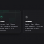
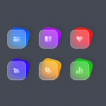
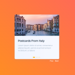
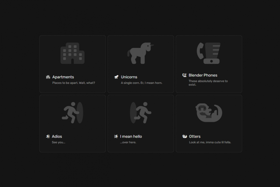
Demo
I would recommend you don’t just copy and paste the code, just look at the code and type by understanding it.
HTML – Starter Template
<!doctype html>
<html lang="en">

<head>
    <!-- Required meta tags -->
    <meta charset="utf-8">
    <meta name="viewport" content="width=device-width, initial-scale=1">

    <!-- CSS -->
    <link rel="stylesheet" href="style.css">

    <title>Magical Hover Effect HTML CSS & JS - Anoncodes</title>
</head>

<body>
    <!-- Further code here -->

     <script src="script.js"></script>
</body>

</html>
Paste the below code in your <body> tag.
<div id="cards">
  <div class="card">
    <div class="card-content">
      <div class="card-image">
        <i class="fa-duotone fa-apartment"></i>
      </div>
      <div class="card-info-wrapper">
        <div class="card-info">
          <i class="fa-duotone fa-apartment"></i>
          <div class="card-info-title">
            <h3>Apartments</h3>
            <h4>Places to be apart. Wait, what?</h4>
          </div>
        </div>
      </div>
    </div>
  </div>
  <div class="card">
    <div class="card-content">
      <div class="card-image">
        <i class="fa-duotone fa-unicorn"></i>
      </div>
      <div class="card-info-wrapper">
        <div class="card-info">
          <i class="fa-duotone fa-unicorn"></i>
          <div class="card-info-title">
            <h3>Unicorns</h3>
            <h4>A single corn. Er, I mean horn.</h4>
          </div>
        </div>
      </div>
    </div>
  </div>
  <div class="card">
    <div class="card-content">
      <div class="card-image">
        <i class="fa-duotone fa-blender-phone"></i>
      </div>
      <div class="card-info-wrapper">
        <div class="card-info">
          <i class="fa-duotone fa-blender-phone"></i>
          <div class="card-info-title">
            <h3>Blender Phones</h3>
            <h4>These absolutely deserve to exist.</h4>
          </div>
        </div>
      </div>
    </div>
  </div>
  <div class="card">
    <div class="card-content">
      <div class="card-image">
        <i class="fa-duotone fa-person-to-portal"></i>
      </div>
      <div class="card-info-wrapper">
        <div class="card-info">
          <i class="fa-duotone fa-person-to-portal"></i>
          <div class="card-info-title">
            <h3>Adios</h3>
            <h4>See you...</h4>
          </div>
        </div>
      </div>
    </div>
  </div>
  <div class="card">
    <div class="card-content">
      <div class="card-image">
        <i class="fa-duotone fa-person-from-portal"></i>
      </div>
      <div class="card-info-wrapper">
        <div class="card-info">
          <i class="fa-duotone fa-person-from-portal"></i>
          <div class="card-info-title">
            <h3>I mean hello</h3>
            <h4>...over here.</h4>
          </div>
        </div>
      </div>
    </div>
  </div>
  <div class="card">
    <div class="card-content">
      <div class="card-image">
        <i class="fa-duotone fa-otter"></i>
      </div>
      <div class="card-info-wrapper">
        <div class="card-info">
          <i class="fa-duotone fa-otter"></i>
          <div class="card-info-title">
            <h3>Otters</h3>
            <h4>Look at me, imma cute lil fella.</h4>
          </div>
        </div>
      </div>
    </div>
  </div>
</div>


</a>
CSS Code
Create a file style.css and paste the code below.
:root {
  --bg-color: rgb(20, 20, 20);
  --card-color: rgb(23, 23, 23);
}

body {
  align-items: center;
  background-color: var(--bg-color);
  display: flex;
  height: 100vh;
  justify-content: center;
  margin: 0px;
  overflow: hidden;
  padding: 0px;
}

#cards {
  display: flex;
  flex-wrap: wrap;
  gap: 8px;
  max-width: 916px;
  width: calc(100% - 20px);
}

#cards:hover > .card::after {
  opacity: 1;
}

.card {
  background-color: rgba(255, 255, 255, 0.1);
  border-radius: 10px;
  cursor: pointer;
  display: flex;
  height: 260px;
  flex-direction: column;
  position: relative;
  width: 300px;
}

.card:hover::before {
  opacity: 1;
}

.card::before,
.card::after {
  border-radius: inherit;
  content: "";
  height: 100%;
  left: 0px;
  opacity: 0;
  position: absolute;
  top: 0px;
  transition: opacity 500ms;
  width: 100%;
}

.card::before {
  background: radial-gradient(
    800px circle at var(--mouse-x) var(--mouse-y),
    rgba(255, 255, 255, 0.06),
    transparent 40%
  );
  z-index: 3;
}

.card::after {
  background: radial-gradient(
    600px circle at var(--mouse-x) var(--mouse-y),
    rgba(255, 255, 255, 0.4),
    transparent 40%
  );
  z-index: 1;
}

.card > .card-content {
  background-color: var(--card-color);
  border-radius: inherit;
  display: flex;
  flex-direction: column;
  flex-grow: 1;
  inset: 1px;
  padding: 10px;
  position: absolute;
  z-index: 2;
}

/* -- ↓ ↓ ↓ extra card content styles ↓ ↓ ↓ -- */

h1, h2, h3, h4, span {
  color: rgb(240, 240, 240);
  font-family: "Rubik", sans-serif;
  font-weight: 400;
  margin: 0px;
}

i {
  color: rgb(240, 240, 240);
}

.card-image {
  align-items: center;
  display: flex;
  height: 140px;
  justify-content: center;
  overflow: hidden;
}

.card-image > i {
  font-size: 6em;
  opacity: 0.25;
}

.card-info-wrapper {
  align-items: center;
  display: flex;
  flex-grow: 1;
  justify-content: flex-start;
  padding: 0px 20px;
}

.card-info {
  align-items: flex-start;
  display: flex;
  gap: 10px;
}

.card-info > i {
  font-size: 1em;
  height: 20px;
  line-height: 20px;
}

.card-info-title > h3 {
  font-size: 1.1em;
  line-height: 20px;
}

.card-info-title > h4 {
  color: rgba(255, 255, 255, 0.5);
  font-size: 0.85em;
  margin-top: 8px;
}

/* -- ↓ ↓ ↓ some responsiveness ↓ ↓ ↓ -- */

@media(max-width: 1000px) {
  body {
    align-items: flex-start;
    overflow: auto;
  }

  #cards {
    max-width: 1000px;
    padding: 10px 0px;
  }

  .card {
    flex-shrink: 1;
    width: calc(50% - 4px);
  }
}

@media(max-width: 500px) {
  .card {
    height: 180px;
  }

  .card-image {
    height: 80px;
  }

  .card-image > i {
    font-size: 3em;
  }

  .card-info-wrapper {
    padding: 0px 10px;
  }

  .card-info > i {
    font-size: 0.8em;
  }

  .card-info-title > h3 {
    font-size: 0.9em;
  }

  .card-info-title > h4 {
    font-size: 0.8em;
    margin-top: 4px;
  }
}

@media(max-width: 320px) {
  .card {
    width: 100%;
  }
}

/* -- ↓ ↓ ↓ YouTube link styles ↓ ↓ ↓ -- */

#youtube-link {
  bottom: 10px;
}

#youtube-link > i {
  color: rgb(239, 83, 80);
}

#source-link {
  bottom: 60px;
}

#source-link > i {
  color: rgb(94, 106, 210);
}

.link {
  align-items: center;
  backdrop-filter: blur(3px);
  background-color: rgba(255, 255, 255, 0.05);
  border: 1px solid rgba(255, 255, 255, 0.1);
  border-radius: 6px;
  box-shadow: 2px 2px 2px rgba(0, 0, 0, 0.1);
  cursor: pointer;
  display: inline-flex;
  gap: 5px;
  left: 10px;
  padding: 10px 20px;
  position: fixed;
  text-decoration: none;
  z-index: 100;
}

.link:hover {
  background-color: rgba(255, 255, 255, 0.1);
  border: 1px solid rgba(255, 255, 255, 0.2);
}

.link > i, .link > span {
  height: 20px;
  line-height: 20px;
}

.link > span {
  color: white;
}
Javascript Code
Create a file index.js and paste the code below.
document.getElementById("cards").onmousemove = e => {
  for(const card of document.getElementsByClassName("card")) {
    const rect = card.getBoundingClientRect(),
          x = e.clientX - rect.left,
          y = e.clientY - rect.top;

    card.style.setProperty("--mouse-x", `${x}px`);
    card.style.setProperty("--mouse-y", `${y}px`);
  };
}
Written By : @anoncodes
Code Credit : @Hyperplexed
Hope you find this post helpful 💖⭐
Show Some Love and Support On These Social Media