A dropdown in HTML and CSS is a user interface element used to display a menu of options that can be expanded or collapsed. It provides users with the ability to select a single option from a list.
To create a dropdown menu in HTML, you typically use a combination of HTML and CSS. The HTML structure involves an outer container element, such as a <div> or <ul>, which contains one or more nested elements representing the options. CSS is then utilized to style the dropdown menu and control its visibility.
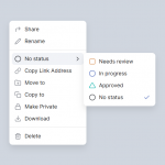
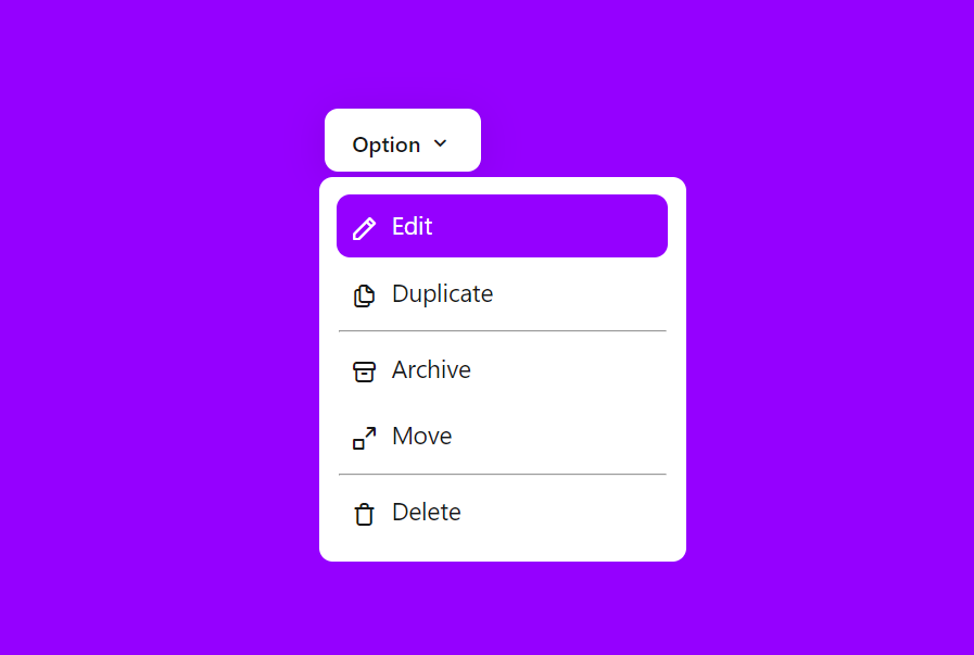
Demo
I would recommend you don’t just copy and paste the code, Watch this My YouTube video and Understand it.
HTML – Starter Template
<!doctype html>
<html lang="en">

<head>
    <!-- Required meta tags -->
    <meta charset="utf-8">
    <meta name="viewport" content="width=device-width, initial-scale=1">

    <!-- CSS -->
    <link rel="stylesheet" href="style.css">

    <title> Dropdown - Anoncodes </title>
</head>

<body>
    <!-- Further code here -->

     <script src="script.js"></script>
</body>

</html>
Paste the below code in your <body> tag.
<div id="dropdown">
        <button id="dropbtn">Option <i class="uil uil-angle-down"></i></button>
        <div id="drop-content">
            <a href="#"><i class="uil uil-pen"></i> Edit</a>
            <a href="#"><i class="uil uil-copy"></i> Duplicate</a>
            <hr>
            <a href="#"><i class="uil uil-archive"></i> Archive</a>
            <a href="#"><i class="uil uil-expand-from-corner"></i> Move</a>
            <hr>
            <a href="#"><i class="uil uil-trash"></i> Delete</a>
        </div>
CSS Code
Create a file style.css and paste the code below.
/* CSS Reset */
*{
    padding: 0;
    margin: 0;
    font-family: system-ui, -apple-system, BlinkMacSystemFont, 'Segoe UI', Roboto, Oxygen, Ubuntu, Cantarell, 'Open Sans', 'Helvetica Neue', sans-serif;
}
body{
    display: flex;
    justify-content: center;
    align-items: center;
    min-height: 100vh;
    background: #9500ff;
}
/* Button */
#dropbtn{
    padding: 10px 20px;
    font-size: 16px;
    background: #fff;
    border: none;
    color: #181818;
    border-radius: 10px;
    box-shadow: 0px 4px 30px rgba(0,0,0,0.1);
    margin: 4px;
    font-weight: 500;
}
#dropbtn i{
    font-size: 20px;
}
#drop-content{
    display: none;
    position: absolute;
    padding: 10px;
    display:none;
    flex-direction: column;
    min-width: 250px;
    background: #fff;
    border-radius: 10px;
    box-shadow:0px 8px 30pxrgba(0,0,0,0.1);
}
#drop-content a{
    display: flex;
    text-decoration: none;
    font-size: 18px;
    color: #181818;
    padding: 10px;
    margin: 3px;
}
#drop-content a i{
    font-size: 20px;
    padding-right: 10px;
}
#drop-content a:hover{
    background: #9500ff;
    transition: background 0.5s;
    border-radius: 10px;
    color: #fff;
}
hr{
    margin: 4px;
}
/* Let's Create it DropDown */


#dropdown:hover #drop-content{
    display: block;
}
Written By : @anoncodes
Code Credit : @anoncodes.
Hope you find this post helpful 💖
Show Some Love & Support On These Social Media