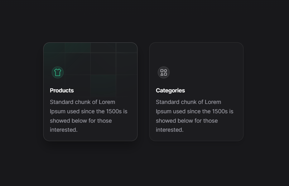
A card hover effect is an interactive design technique employed on websites or applications, where hovering the cursor over a card element triggers a visual or interactive response. When a user hovers over a card, which typically contains content or imagery, the card can undergo transformations, animations, or display additional information, resulting in an engaging and dynamic user experience.
Card hover effects serve multiple purposes, such as enhancing the visual appeal of a webpage, providing supplementary context or details about the card content, or guiding users towards clickable actions. These effects can encompass a wide range of styles, from simple transitions and scaling effects to more intricate animations, such as flipping, rotating, or unveiling hidden elements.
The utilization of card hover effects is widespread across various contexts, including portfolios, image galleries, product listings, and interactive menus. By introducing interactivity to static elements, card hover effects seize users’ attention, promote exploration, and improve usability by offering visual cues.
Implementing card hover effects typically involves employing CSS (Cascading Style Sheets) alongside JavaScript or jQuery to define the desired behavior and animations. This combination empowers web developers to craft visually captivating and interactive cards that elevate the overall user interface.
Demo
I would recommend you don’t just copy and paste the code, just look at the code and type by understanding it.
HTML – Starter Template
<!doctype html>
<html lang="en">

<head>
    <!-- Required meta tags -->
    <meta charset="utf-8">
    <meta name="viewport" content="width=device-width, initial-scale=1">

    <!-- CSS -->
    <link rel="stylesheet" href="style.css">

    <title>Card Hover Effect - Anoncodes </title>
</head>

<body>
    <!-- Further code here -->

     <script src="script.js"></script>
</body>

</html>
Paste the below code in your <body> tag.
<div class="grid">
<div class="card">
<span class="icon">
<svg
viewBox="0 0 24 24"
fill="none"
stroke="currentColor"
stroke-width="1.2"
stroke-linecap="round"
stroke-linejoin="round"
xmlns="http://www.w3.org/2000/svg"
>
<path
d="M14.5 3.5C14.5 3.5 14.5 5.5 12 5.5C9.5 5.5 9.5 3.5 9.5 3.5H7.5L4.20711 6.79289C3.81658 7.18342 3.81658 7.81658 4.20711 8.20711L6.5 10.5V20.5H17.5V10.5L19.7929 8.20711C20.1834 7.81658 20.1834 7.18342 19.7929 6.79289L16.5 3.5H14.5Z"
/>
</svg>
</span>
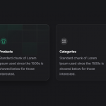
<h4>Products</h4>
<p>
Standard chunk of Lorem Ipsum used since the 1500s is showed below
for those interested.
</p>
<div class="shine"></div>
<div class="background">
<div class="tiles">
<div class="tile tile-1"></div>
<div class="tile tile-2"></div>
<div class="tile tile-3"></div>
<div class="tile tile-4"></div>
<div class="tile tile-5"></div>
<div class="tile tile-6"></div>
<div class="tile tile-7"></div>
<div class="tile tile-8"></div>
<div class="tile tile-9"></div>
<div class="tile tile-10"></div>
</div>
<div class="line line-1"></div>
<div class="line line-2"></div>
<div class="line line-3"></div>
</div>
</div>
<div class="card">
<span class="icon">
<svg
viewBox="0 0 24 24"
fill="none"
stroke="currentColor"
stroke-width="1.2"
stroke-linecap="round"
stroke-linejoin="round"
xmlns="http://www.w3.org/2000/svg"
>
<path
d="M4.5 9.5V5.5C4.5 4.94772 4.94772 4.5 5.5 4.5H9.5C10.0523 4.5 10.5 4.94772 10.5 5.5V9.5C10.5 10.0523 10.0523 10.5 9.5 10.5H5.5C4.94772 10.5 4.5 10.0523 4.5 9.5Z"
/>
<path
d="M13.5 18.5V14.5C13.5 13.9477 13.9477 13.5 14.5 13.5H18.5C19.0523 13.5 19.5 13.9477 19.5 14.5V18.5C19.5 19.0523 19.0523 19.5 18.5 19.5H14.5C13.9477 19.5 13.5 19.0523 13.5 18.5Z"
/>
<path d="M4.5 19.5L7.5 13.5L10.5 19.5H4.5Z" />
<path
d="M16.5 4.5C18.1569 4.5 19.5 5.84315 19.5 7.5C19.5 9.15685 18.1569 10.5 16.5 10.5C14.8431 10.5 13.5 9.15685 13.5 7.5C13.5 5.84315 14.8431 4.5 16.5 4.5Z"
/>
</svg>
</span>
<h4>Categories</h4>
<p>
Standard chunk of Lorem Ipsum used since the 1500s is showed below
for those interested.
</p>
<div class="shine"></div>
<div class="background">
<div class="tiles">
<div class="tile tile-1"></div>
<div class="tile tile-2"></div>
<div class="tile tile-3"></div>
<div class="tile tile-4"></div>
<div class="tile tile-5"></div>
<div class="tile tile-6"></div>
<div class="tile tile-7"></div>
<div class="tile tile-8"></div>
<div class="tile tile-9"></div>
<div class="tile tile-10"></div>
</div>
<div class="line line-1"></div>
<div class="line line-2"></div>
<div class="line line-3"></div>
</div>
</div>
</div>
<label class="day-night">
<input type="checkbox" checked />
<div></div>
</label>
<!-- twitter -->
<a class="twitter" target="_top" href="https://twitter.com/aaroniker_me"><svg xmlns="http://www.w3.org/2000/svg" width="72" height="72" viewBox="0 0 72 72"><path d="M67.812 16.141a26.246 26.246 0 0 1-7.519 2.06 13.134 13.134 0 0 0 5.756-7.244 26.127 26.127 0 0 1-8.313 3.176A13.075 13.075 0 0 0 48.182 10c-7.229 0-13.092 5.861-13.092 13.093 0 1.026.118 2.021.338 2.981-10.885-.548-20.528-5.757-26.987-13.679a13.048 13.048 0 0 0-1.771 6.581c0 4.542 2.312 8.551 5.824 10.898a13.048 13.048 0 0 1-5.93-1.638c-.002.055-.002.11-.002.162 0 6.345 4.513 11.638 10.504 12.84a13.177 13.177 0 0 1-3.449.457c-.846 0-1.667-.078-2.465-.231 1.667 5.2 6.499 8.986 12.23 9.09a26.276 26.276 0 0 1-16.26 5.606A26.21 26.21 0 0 1 4 55.976a37.036 37.036 0 0 0 20.067 5.882c24.083 0 37.251-19.949 37.251-37.249 0-.566-.014-1.134-.039-1.694a26.597 26.597 0 0 0 6.533-6.774z"></path></svg></a>
CSS Code
Create a file style.css and paste the code below.
body {
  --background-color: #18181B;
  --text-color: #A1A1AA;

  --card-background-color: rgba(255, 255, 255, .015);
  --card-border-color: rgba(255, 255, 255, 0.1);
  --card-box-shadow-1: rgba(0, 0, 0, 0.05);
  --card-box-shadow-1-y: 3px;
  --card-box-shadow-1-blur: 6px;
  --card-box-shadow-2: rgba(0, 0, 0, 0.1);
  --card-box-shadow-2-y: 8px;
  --card-box-shadow-2-blur: 15px;
  --card-label-color: #FFFFFF;
  --card-icon-color: #D4D4D8;
  --card-icon-background-color: rgba(255, 255, 255, 0.08);
  --card-icon-border-color: rgba(255, 255, 255, 0.12);
  --card-shine-opacity: .1;
  --card-shine-gradient: conic-gradient(from 205deg at 50% 50%, rgba(16, 185, 129, 0) 0deg, #10B981 25deg, rgba(52, 211, 153, 0.18) 295deg, rgba(16, 185, 129, 0) 360deg);
  --card-line-color: #2A2B2C;
  --card-tile-color: rgba(16, 185, 129, 0.05);

  --card-hover-border-color: rgba(255, 255, 255, 0.2);
  --card-hover-box-shadow-1: rgba(0, 0, 0, 0.04);
  --card-hover-box-shadow-1-y: 5px;
  --card-hover-box-shadow-1-blur: 10px;
  --card-hover-box-shadow-2: rgba(0, 0, 0, 0.3);
  --card-hover-box-shadow-2-y: 15px;
  --card-hover-box-shadow-2-blur: 25px;
  --card-hover-icon-color: #34D399;
  --card-hover-icon-background-color: rgba(52, 211, 153, 0.1);
  --card-hover-icon-border-color: rgba(52, 211, 153, 0.2);

  --blur-opacity: .01;

  &.light {
    --background-color: #FAFAFA;
    --text-color: #52525B;

    --card-background-color: transparent;
    --card-border-color: rgba(24, 24, 27, 0.08);
    --card-box-shadow-1: rgba(24, 24, 27, 0.02);
    --card-box-shadow-1-y: 3px;
    --card-box-shadow-1-blur: 6px;
    --card-box-shadow-2: rgba(24, 24, 27, 0.04);
    --card-box-shadow-2-y: 2px;
    --card-box-shadow-2-blur: 7px;
    --card-label-color: #18181B;
    --card-icon-color: #18181B;
    --card-icon-background-color: rgba(24, 24, 27, 0.04);
    --card-icon-border-color: rgba(24, 24, 27, 0.1);
    --card-shine-opacity: .3;
    --card-shine-gradient: conic-gradient(from 225deg at 50% 50%, rgba(16, 185, 129, 0) 0deg, #10B981 25deg, #EDFAF6 285deg, #FFFFFF 345deg, rgba(16, 185, 129, 0) 360deg);
    --card-line-color: #E9E9E7;
    --card-tile-color: rgba(16, 185, 129, 0.08);

    --card-hover-border-color: rgba(24, 24, 27, 0.15);
    --card-hover-box-shadow-1: rgba(24, 24, 27, 0.05);
    --card-hover-box-shadow-1-y: 3px;
    --card-hover-box-shadow-1-blur: 6px;
    --card-hover-box-shadow-2: rgba(24, 24, 27, 0.1);
    --card-hover-box-shadow-2-y: 8px;
    --card-hover-box-shadow-2-blur: 15px;
    --card-hover-icon-color: #18181B;
    --card-hover-icon-background-color: rgba(24, 24, 27, 0.04);
    --card-hover-icon-border-color: rgba(24, 24, 27, 0.34);

    --blur-opacity: .1;
  }

  &.toggle .grid * {
    transition-duration: 0s !important;
  }
}

.grid {
  display: grid;
  grid-template-columns: repeat(2, 240px);
  grid-gap: 32px;
  position: relative;
  z-index: 1;
}

.card {
  background-color: var(--background-color);
  box-shadow: 0px var(--card-box-shadow-1-y) var(--card-box-shadow-1-blur) var(--card-box-shadow-1), 0px var(--card-box-shadow-2-y) var(--card-box-shadow-2-blur) var(--card-box-shadow-2), 0 0 0 1px var(--card-border-color);
  padding: 56px 16px 16px 16px;
  border-radius: 15px;
  cursor: pointer;
  position: relative;
  transition: box-shadow .25s;

  &::before {
    content: '';
    position: absolute;
    inset: 0;
    border-radius: 15px;
    background-color: var(--card-background-color);
  }

  .icon {
    z-index: 2;
    position: relative;
    display: table;
    padding: 8px;

    &::after {
      content: '';
      position: absolute;
      inset: 4.5px;
      border-radius: 50%;
      background-color: var(--card-icon-background-color);
      border: 1px solid var(--card-icon-border-color);
      backdrop-filter: blur(2px);
      transition: background-color .25s, border-color .25s;
    }

    svg {
      position: relative;
      z-index: 1;
      display: block;
      width: 24px;
      height: 24px;
      transform: translateZ(0);
      color: var(--card-icon-color);
      transition: color .25s;
    }
  }

  h4 {
    z-index: 2;
    position: relative;
    margin: 12px 0 4px 0;
    font-family: inherit;
    font-weight: 600;
    font-size: 14px;
    line-height: 2;
    color: var(--card-label-color);
  }

  p {
    z-index: 2;
    position: relative;
    margin: 0;
    font-size: 14px;
    line-height: 1.7;
    color: var(--text-color);
  }

  .shine {
    border-radius: inherit;
    position: absolute;
    inset: 0;
    z-index: 1;
    overflow: hidden;
    opacity: 0;
    transition: opacity .5s;

    &:before {
      content: '';
      width: 150%;
      padding-bottom: 150%;
      border-radius: 50%;
      position: absolute;
      left: 50%;
      bottom: 55%;
      filter: blur(35px);
      opacity: var(--card-shine-opacity);
      transform: translateX(-50%);
      background-image: var(--card-shine-gradient);
    }
  }

  .background {
    border-radius: inherit;
    position: absolute;
    inset: 0;
    overflow: hidden;
    -webkit-mask-image: radial-gradient(circle at 60% 5%, black 0%, black 15%, transparent 60%);
    mask-image: radial-gradient(circle at 60% 5%, black 0%, black 15%, transparent 60%);

    .tiles {
      opacity: 0;
      transition: opacity .25s;

      .tile {
        position: absolute;
        background-color: var(--card-tile-color);
        animation-duration: 8s;
        animation-iteration-count: infinite;
        opacity: 0;

        &.tile-4,
        &.tile-6,
        &.tile-10 {
          animation-delay: -2s;
        }

        &.tile-3,
        &.tile-5,
        &.tile-8 {
          animation-delay: -4s;
        }

        &.tile-2,
        &.tile-9 {
          animation-delay: -6s;
        }

        &.tile-1 {
          top: 0;
          left: 0;
          height: 10%;
          width: 22.5%;
        }

        &.tile-2 {
          top: 0;
          left: 22.5%;
          height: 10%;
          width: 27.5%;
        }

        &.tile-3 {
          top: 0;
          left: 50%;
          height: 10%;
          width: 27.5%;
        }

        &.tile-4 {
          top: 0;
          left: 77.5%;
          height: 10%;
          width: 22.5%;
        }

        &.tile-5 {
          top: 10%;
          left: 0;
          height: 22.5%;
          width: 22.5%;
        }

        &.tile-6 {
          top: 10%;
          left: 22.5%;
          height: 22.5%;
          width: 27.5%;
        }

        &.tile-7 {
          top: 10%;
          left: 50%;
          height: 22.5%;
          width: 27.5%;
        }

        &.tile-8 {
          top: 10%;
          left: 77.5%;
          height: 22.5%;
          width: 22.5%;
        }

        &.tile-9 {
          top: 32.5%;
          left: 50%;
          height: 22.5%;
          width: 27.5%;
        }

        &.tile-10 {
          top: 32.5%;
          left: 77.5%;
          height: 22.5%;
          width: 22.5%;
        }
      }
    }

    @keyframes tile {

      0%,
      12.5%,
      100% {
        opacity: 1;
      }

      25%,
      82.5% {
        opacity: 0;
      }
    }

    .line {
      position: absolute;
      inset: 0;
      opacity: 0;
      transition: opacity .35s;

      &:before,
      &:after {
        content: '';
        position: absolute;
        background-color: var(--card-line-color);
        transition: transform .35s;
      }

      &:before {
        left: 0;
        right: 0;
        height: 1px;
        transform-origin: 0 50%;
        transform: scaleX(0);
      }

      &:after {
        top: 0;
        bottom: 0;
        width: 1px;
        transform-origin: 50% 0;
        transform: scaleY(0);
      }

      &.line-1 {
        &:before {
          top: 10%;
        }

        &:after {
          left: 22.5%;
        }

        &:before,
        &:after {
          transition-delay: .3s;
        }
      }

      &.line-2 {
        &:before {
          top: 32.5%;
        }

        &:after {
          left: 50%;
        }

        &:before,
        &:after {
          transition-delay: .15s;
        }
      }

      &.line-3 {
        &:before {
          top: 55%;
        }

        &:after {
          right: 22.5%;
        }
      }
    }
  }

  &:hover {
    box-shadow: 0px 3px 6px var(--card-hover-box-shadow-1), 0px var(--card-hover-box-shadow-2-y) var(--card-hover-box-shadow-2-blur) var(--card-hover-box-shadow-2), 0 0 0 1px var(--card-hover-border-color);

    .icon {
      &::after {
        background-color: var(--card-hover-icon-background-color);
        border-color: var(--card-hover-icon-border-color);
      }

      svg {
        color: var(--card-hover-icon-color);
      }
    }

    .shine {
      opacity: 1;
      transition-duration: .5s;
      transition-delay: 0s;
    }

    .background {

      .tiles {
        opacity: 1;
        transition-delay: .25s;

        .tile {
          animation-name: tile;
        }
      }

      .line {
        opacity: 1;
        transition-duration: .15s;

        &:before {
          transform: scaleX(1);
        }

        &:after {
          transform: scaleY(1);
        }

        &.line-1 {

          &:before,
          &:after {
            transition-delay: .0s;
          }
        }

        &.line-2 {

          &:before,
          &:after {
            transition-delay: .15s;
          }
        }

        &.line-3 {

          &:before,
          &:after {
            transition-delay: .3s;
          }
        }
      }
    }
  }
}

.day-night {
  cursor: pointer;
  position: absolute;
  right: 20px;
  top: 20px;
  opacity: .3;

  input {
    display: none;

    &+div {
      border-radius: 50%;
      width: 20px;
      height: 20px;
      position: relative;
      box-shadow: inset 8px -8px 0 0 var(--text-color);
      transform: scale(1) rotate(-2deg);
      transition: box-shadow .5s ease 0s, transform .4s ease .1s;

      &:before {
        content: '';
        width: inherit;
        height: inherit;
        border-radius: inherit;
        position: absolute;
        left: 0;
        top: 0;
        transition: background-color .3s ease;
      }

      &:after {
        content: '';
        width: 6px;
        height: 6px;
        border-radius: 50%;
        margin: -3px 0 0 -3px;
        position: absolute;
        top: 50%;
        left: 50%;
        box-shadow: 0 -23px 0 var(--text-color), 0 23px 0 var(--text-color), 23px 0 0 var(--text-color), -23px 0 0 var(--text-color), 15px 15px 0 var(--text-color), -15px 15px 0 var(--text-color), 15px -15px 0 var(--text-color), -15px -15px 0 var(--text-color);
        transform: scale(0);
        transition: all .3s ease;
      }
    }

    &:checked+div {
      box-shadow: inset 20px -20px 0 0 var(--text-color);
      transform: scale(.5) rotate(0deg);
      transition: transform .3s ease .1s, box-shadow .2s ease 0s;

      &:before {
        background: var(--text-color);
        transition: background-color .3s ease .1s;
      }

      &:after {
        transform: scale(1);
        transition: transform .5s ease .15s;
      }
    }
  }
}

html {
  box-sizing: border-box;
  -webkit-font-smoothing: antialiased;
}

* {
  box-sizing: inherit;
  &:before,
  &:after {
    box-sizing: inherit;
  }
}

// Center
body {
  min-height: 100vh;
  display: flex;
  font-family: 'Inter', Arial;
  justify-content: center;
  align-items: center;
  background-color: var(--background-color);
  overflow: hidden;

  &:before {
    content: '';
    position: absolute;
    inset: 0 -60% 65% -60%;
    background-image: radial-gradient(ellipse at top, #10B981 0%, var(--background-color) 50%);
    opacity: var(--blur-opacity);
  }

  .twitter {
    position: fixed;
    display: block;
    right: 12px;
    bottom: 12px;
    svg {
      width: 32px;
      height: 32px;
      fill: #fff;
    }
  }
}
Javascript Code
Create a file index.js and paste the code below.
// Dark & Light toggle

document.querySelector(".day-night input").addEventListener("change", () => {
  document.querySelector("body").classList.add("toggle");
  setTimeout(() => {
    document.querySelector("body").classList.toggle("light");

    setTimeout(
      () => document.querySelector("body").classList.remove("toggle"),
      10
    );
  }, 5);
});
Written By ; @anoncodes
Code Credit : @aaroniker