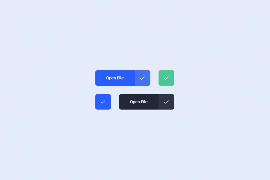
An animated download button can be created using HTML, CSS, and JavaScript to provide users with an engaging and interactive way to download content from a website. This type of button typically includes an icon or text that indicates to the user that they can download content. When the user clicks on the button, it triggers a series of animations that provide feedback, such as a loading spinner or progress bar.
To create the button, CSS can be used to design its appearance, including its background, border, text, and hover effects. JavaScript can then be used to add functionality to the button, such as creating a download link and triggering animations when clicked.
Overall, an animated download button can be an effective way to encourage users to download content while also providing them with a visually appealing and interactive experience.
Demo
I would recommend you don’t just copy and paste the code, just look at the code and type by understanding it.
HTML Code – Starter Tamplate
<!doctype html>
<html lang="en">

<head>
    <!-- Required meta tags -->
    <meta charset="utf-8">
    <meta name="viewport" content="width=device-width, initial-scale=1">

    <!-- CSS -->
    <link rel="stylesheet" href="style.css">

    <title>IPhone X Animation using HTML and CSS - Coding Torque</title>
</head>

<body>
    <!-- Further code here -->

     <script src="script.js"></script>
</body>

</html>
Paste the below code in your <body> tag.
<div class="container">
<a href="" class="button">
<ul>
<li>Download</li>
<li>Downloading</li>
<li>Open File</li>
</ul>
<div>
<svg viewBox="0 0 24 24"></svg>
</div>
</a>
<a href="" class="button dark-single">
<div>
<svg viewBox="0 0 24 24"></svg>
</div>
</a>
<div></div>
<a href="" class="button white-single">
<div>
<svg viewBox="0 0 24 24"></svg>
</div>
</a>
<a href="" class="button dark">
<ul>
<li>Download</li>
<li>Downloading</li>
<li>Open File</li>
</ul>
<div>
<svg viewBox="0 0 24 24"></svg>
</div>
</a>
</div>
<!-- dribbble -->
<a class="dribbble" href="https://dribbble.com/shots/7299868-Download-Buttons" target="_blank"><img src="https://cdn.dribbble.com/assets/dribbble-ball-mark-2bd45f09c2fb58dbbfb44766d5d1d07c5a12972d602ef8b32204d28fa3dda554.svg" alt=""></a>
CSS Code
Create a file style.css and paste the code below.
.button {
    &.dark-single {
        --background: none;
        --rectangle: #242836;
        --success: #4BC793;
    }
    &.white-single {
        --background: none;
        --rectangle: #F5F9FF;
        --arrow: #275efe;
        --success: #275efe;
        --shadow: rgba(10, 22, 50, .1);
    }
    &.dark {
        --background: #242836;
        --rectangle: #1C212E;
        --arrow: #F5F9FF;
        --text: #F5F9FF;
        --success: #2F3545;
    }
}

.button {
    --background: #275efe;
    --rectangle: #184fee;
    --success: #{mix(white, #184fee, 20%)};
    --text: #fff;
    --arrow: #fff;
    --checkmark: #fff;
    --shadow: rgba(10, 22, 50, .24);
    display: flex;
    overflow: hidden;
    text-decoration: none;
    -webkit-mask-image: -webkit-radial-gradient(white, black);
    background: var(--background);
    border-radius: 8px;
    box-shadow: 0 2px 8px -1px var(--shadow);
    transition: transform .2s ease, box-shadow .2s ease;
    &:active {
        transform: scale(.95);
        box-shadow: 0 1px 4px -1px var(--shadow);
    }
    ul {
        margin: 0;
        padding: 16px 40px;
        list-style: none;
        text-align: center;
        position: relative;
        backface-visibility: hidden;
        font-size: 16px;
        font-weight: 500;
        line-height: 28px;
        color: var(--text);
        li {
            &:not(:first-child) {
                top: 16px;
                left: 0;
                right: 0;
                position: absolute;
            }
            &:nth-child(2) {
                top: 76px;
            }
            &:nth-child(3) {
                top: 136px;
            }
        }
    }
    & > div {
        position: relative;
        width: 60px;
        height: 60px;
        background: var(--rectangle);
        &:before,
        &:after {
            content: '';
            display: block;
            position: absolute;
        }
        &:before {
            border-radius: 1px;
            width: 2px;
            top: 50%;
            left: 50%;
            height: 17px;
            margin: -9px 0 0 -1px;
            background: var(--arrow);
        }
        &:after {
            width: 60px;
            height: 60px;
            transform-origin: 50% 0;
            border-radius: 0 0 80% 80%;
            background: var(--success);
            top: 0;
            left: 0;
            transform: scaleY(0);
        }
        svg {
            display: block;
            position: absolute;
            width: 20px;
            height: 20px;
            left: 50%;
            top: 50%;
            margin: -9px 0 0 -10px;
            fill: none;
            z-index: 1;
            stroke-width: 2px;
            stroke: var(--arrow);
            stroke-linecap: round;
            stroke-linejoin: round;
        }
    }
    &.loading {
        ul {
            animation: text calc(var(--duration) * 1ms) linear forwards calc(var(--duration) * .065ms);
        }
        & > div {
            &:before {
                animation: line calc(var(--duration) * 1ms) linear forwards calc(var(--duration) * .065ms);
            }
            &:after {
                animation: background calc(var(--duration) * 1ms) linear forwards calc(var(--duration) * .065ms);
            }
            svg {
                animation: svg calc(var(--duration) * 1ms) linear forwards calc(var(--duration) * .065ms);
            }
        }
    }
}

@keyframes text {
    10%,
    85% {
        transform: translateY(-100%);
    }
    95%,
    100% {
        transform: translateY(-200%);
    }
}

@keyframes line {
    5%,
    10% {
        transform: translateY(-30px);
    }
    40% {
        transform: translateY(-20px);
    }
    65% {
        transform: translateY(0);
    }
    75%,
    100% {
        transform: translateY(30px);
    }
}

@keyframes svg {
    0%,
    20% {
        stroke-dasharray: 0;
        stroke-dashoffset: 0;
    }
    21%,
    89% {
        stroke-dasharray: 26px;
        stroke-dashoffset: 26px;
        stroke-width: 3px;
        margin: -10px 0 0 -10px;
        stroke: var(--checkmark);
    }
    100% {
        stroke-dasharray: 26px;
        stroke-dashoffset: 0;
        margin: -10px 0 0 -10px;
        stroke: var(--checkmark);
    }
    12% {
        opacity: 1;
    }
    20%,
    89% {
        opacity: 0;
    }
    90%,
    100% {
        opacity: 1;
    }
}

@keyframes background {
    10% {
        transform: scaleY(0);
    }
    40% {
        transform: scaleY(.15);
    }
    65% {
        transform: scaleY(.5);
        border-radius: 0 0 50% 50%;
    }
    75% {
        border-radius: 0 0 50% 50%;
    }
    90%,
    100% {
        border-radius: 0;
    }
    75%,
    100% {
        transform: scaleY(1);
    }
}

html {
    box-sizing: border-box;
    -webkit-font-smoothing: antialiased;
}

* {
    box-sizing: inherit;
    &:before,
    &:after {
        box-sizing: inherit;
    }
}

// Center & dribbble
body {
    min-height: 100vh;
    display: flex;
    font-family: 'Roboto', Arial;
    justify-content: center;
    align-items: center;
    background: #E4ECFA;
    .container {
        display: flex;
        flex-wrap: wrap;
        justify-content: center;
        & > div {
            flex-basis: 100%;
            width: 0;
        }
        .button {
            margin: 16px;
            @media(max-width: 400px) {
                margin: 12px;
            }
        }
    }
    .dribbble {
        position: fixed;
        display: block;
        right: 20px;
        bottom: 20px;
        img {
            display: block;
            height: 28px;
        }
    }
}
Javascript Code
Create a file style.css and paste the code below.
document.querySelectorAll('.button').forEach(button => {

    let duration = 3000,
        svg = button.querySelector('svg'),
        svgPath = new Proxy({
            y: null,
            smoothing: null
        }, {
            set(target, key, value) {
                target[key] = value;
                if(target.y !== null && target.smoothing !== null) {
                    svg.innerHTML = getPath(target.y, target.smoothing, null);
                }
                return true;
            },
            get(target, key) {
                return target[key];
            }
        });

    button.style.setProperty('--duration', duration);

    svgPath.y = 20;
    svgPath.smoothing = 0;

    button.addEventListener('click', e => {

        e.preventDefault();

        if(!button.classList.contains('loading')) {

            button.classList.add('loading');

            gsap.to(svgPath, {
                smoothing: .3,
                duration: duration * .065 / 1000
            });

            gsap.to(svgPath, {
                y: 12,
                duration: duration * .265 / 1000,
                delay: duration * .065 / 1000,
                ease: Elastic.easeOut.config(1.12, .4)
            });

            setTimeout(() => {
                svg.innerHTML = getPath(0, 0, [
                    [3, 14],
                    [8, 19],
                    [21, 6]
                ]);
            }, duration / 2);

        }

    });

});

function getPoint(point, i, a, smoothing) {
    let cp = (current, previous, next, reverse) => {
            let p = previous || current,
                n = next || current,
                o = {
                    length: Math.sqrt(Math.pow(n[0] - p[0], 2) + Math.pow(n[1] - p[1], 2)),
                    angle: Math.atan2(n[1] - p[1], n[0] - p[0])
                },
                angle = o.angle + (reverse ? Math.PI : 0),
                length = o.length * smoothing;
            return [current[0] + Math.cos(angle) * length, current[1] + Math.sin(angle) * length];
        },
        cps = cp(a[i - 1], a[i - 2], point, false),
        cpe = cp(point, a[i - 1], a[i + 1], true);
    return `C ${cps[0]},${cps[1]} ${cpe[0]},${cpe[1]} ${point[0]},${point[1]}`;
}

function getPath(update, smoothing, pointsNew) {
    let points = pointsNew ? pointsNew : [
            [4, 12],
            [12, update],
            [20, 12]
        ],
        d = points.reduce((acc, point, i, a) => i === 0 ? `M ${point[0]},${point[1]}` : `${acc} ${getPoint(point, i, a, smoothing)}`, '');
    return `<path d="${d}" />`;
}
Written By : @anoncodes
Code Credit : @aaroniker
If you found any mistakes or have any doubts please feel free to Contact Us.🙏💖
Hope you find this post helpful 💖