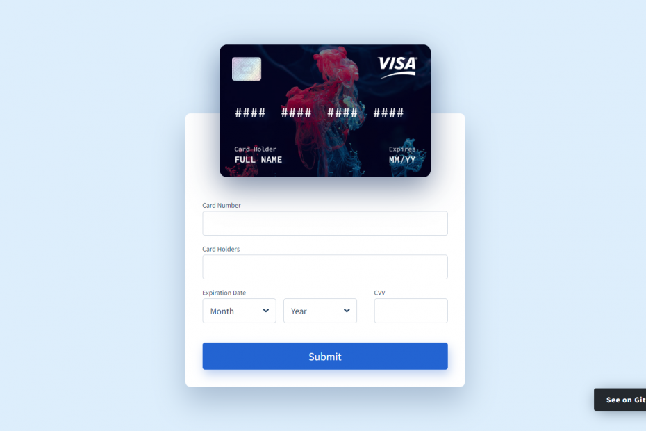
An animated credit card built with Vue.js is an interactive and visually appealing element that can be incorporated into a website or application. Using Vue.js, developers can create a dynamic credit card design that responds to user interactions like hover or click events.
This animated credit card component can display important details regarding the user’s account, including the card number, expiration date, and security code. Additionally, the credit card’s design can be tailored with diverse color schemes and logos, making it adaptable to any business’s branding.
Beyond its aesthetic features, the animated credit card can also provide practical functionalities, such as credit card information validation and seamless integration with payment gateways. Overall, a Vue.js animated credit card can elevate the user experience and simplify the checkout process for customers.
Demo
HTML Starter Template
<!doctype html>
<html lang="en">

<head>
    <!-- Required meta tags -->
    <meta charset="utf-8">
    <meta name="viewport" content="width=device-width, initial-scale=1">

    <!-- CSS -->
    <link rel="stylesheet" href="style.css">

    <title>Animated Credit Card Form - Anoncodes</title>
</head>

<body>
    <!-- Further code here -->

     <script src="script.js"></script>
</body>

</html>
Paste the below code in your <body> tag.
  <div class="wrapper" id="app">
    <div class="card-form">
      <div class="card-list">
        <div class="card-item" v-bind:class="{ '-active' : isCardFlipped }">
          <div class="card-item__side -front">
            <div class="card-item__focus" v-bind:class="{'-active' : focusElementStyle }" v-bind:style="focusElementStyle" ref="focusElement"></div>
            <div class="card-item__cover">
              <img
              v-bind:src="'https://raw.githubusercontent.com/muhammederdem/credit-card-form/master/src/assets/images/' + currentCardBackground + '.jpeg'" class="card-item__bg">
            </div>

            <div class="card-item__wrapper">
              <div class="card-item__top">
                <img src="https://raw.githubusercontent.com/muhammederdem/credit-card-form/master/src/assets/images/chip.png" class="card-item__chip">
                <div class="card-item__type">
                  <transition name="slide-fade-up">
                    <img v-bind:src="'https://raw.githubusercontent.com/muhammederdem/credit-card-form/master/src/assets/images/' + getCardType + '.png'" v-if="getCardType" v-bind:key="getCardType" alt="" class="card-item__typeImg">
                  </transition>
                </div>
              </div>
              <label for="cardNumber" class="card-item__number" ref="cardNumber">
                <template v-if="getCardType === 'amex'">
                 <span v-for="(n, $index) in amexCardMask" :key="$index">
                  <transition name="slide-fade-up">
                    <div
                      class="card-item__numberItem"
                      v-if="$index > 4 && $index < 14 && cardNumber.length > $index && n.trim() !== ''"
                    >*</div>
                    <div class="card-item__numberItem"
                      :class="{ '-active' : n.trim() === '' }"
                      :key="$index" v-else-if="cardNumber.length > $index">
                      {{cardNumber[$index]}}
                    </div>
                    <div
                      class="card-item__numberItem"
                      :class="{ '-active' : n.trim() === '' }"
                      v-else
                      :key="$index + 1"
                    >{{n}}</div>
                  </transition>
                </span>
                </template>

                <template v-else>
                  <span v-for="(n, $index) in otherCardMask" :key="$index">
                    <transition name="slide-fade-up">
                      <div
                        class="card-item__numberItem"
                        v-if="$index > 4 && $index < 15 && cardNumber.length > $index && n.trim() !== ''"
                      >*</div>
                      <div class="card-item__numberItem"
                        :class="{ '-active' : n.trim() === '' }"
                        :key="$index" v-else-if="cardNumber.length > $index">
                        {{cardNumber[$index]}}
                      </div>
                      <div
                        class="card-item__numberItem"
                        :class="{ '-active' : n.trim() === '' }"
                        v-else
                        :key="$index + 1"
                      >{{n}}</div>
                    </transition>
                  </span>
                </template>
              </label>
              <div class="card-item__content">
                <label for="cardName" class="card-item__info" ref="cardName">
                  <div class="card-item__holder">Card Holder</div>
                  <transition name="slide-fade-up">
                    <div class="card-item__name" v-if="cardName.length" key="1">
                      <transition-group name="slide-fade-right">
                        <span class="card-item__nameItem" v-for="(n, $index) in cardName.replace(/\s\s+/g, ' ')" v-if="$index === $index" v-bind:key="$index + 1">{{n}}</span>
                      </transition-group>
                    </div>
                    <div class="card-item__name" v-else key="2">Full Name</div>
                  </transition>
                </label>
                <div class="card-item__date" ref="cardDate">
                  <label for="cardMonth" class="card-item__dateTitle">Expires</label>
                  <label for="cardMonth" class="card-item__dateItem">
                    <transition name="slide-fade-up">
                      <span v-if="cardMonth" v-bind:key="cardMonth">{{cardMonth}}</span>
                      <span v-else key="2">MM</span>
                    </transition>
                  </label>
                  /
                  <label for="cardYear" class="card-item__dateItem">
                    <transition name="slide-fade-up">
                      <span v-if="cardYear" v-bind:key="cardYear">{{String(cardYear).slice(2,4)}}</span>
                      <span v-else key="2">YY</span>
                    </transition>
                  </label>
                </div>
              </div>
            </div>
          </div>
          <div class="card-item__side -back">
            <div class="card-item__cover">
              <img
              v-bind:src="'https://raw.githubusercontent.com/muhammederdem/credit-card-form/master/src/assets/images/' + currentCardBackground + '.jpeg'" class="card-item__bg">
            </div>
            <div class="card-item__band"></div>
            <div class="card-item__cvv">
                <div class="card-item__cvvTitle">CVV</div>
                <div class="card-item__cvvBand">
                  <span v-for="(n, $index) in cardCvv" :key="$index">
                    *
                  </span>

              </div>
                <div class="card-item__type">
                    <img v-bind:src="'https://raw.githubusercontent.com/muhammederdem/credit-card-form/master/src/assets/images/' + getCardType + '.png'" v-if="getCardType" class="card-item__typeImg">
                </div>
            </div>
          </div>
        </div>
      </div>
      <div class="card-form__inner">
        <div class="card-input">
          <label for="cardNumber" class="card-input__label">Card Number</label>
          <input type="text" id="cardNumber" class="card-input__input" v-mask="generateCardNumberMask" v-model="cardNumber" v-on:focus="focusInput" v-on:blur="blurInput" data-ref="cardNumber" autocomplete="off">
        </div>
        <div class="card-input">
          <label for="cardName" class="card-input__label">Card Holders</label>
          <input type="text" id="cardName" class="card-input__input" v-model="cardName" v-on:focus="focusInput" v-on:blur="blurInput" data-ref="cardName" autocomplete="off">
        </div>
        <div class="card-form__row">
          <div class="card-form__col">
            <div class="card-form__group">
              <label for="cardMonth" class="card-input__label">Expiration Date</label>
              <select class="card-input__input -select" id="cardMonth" v-model="cardMonth" v-on:focus="focusInput" v-on:blur="blurInput" data-ref="cardDate">
                <option value="" disabled selected>Month</option>
                <option v-bind:value="n < 10 ? '0' + n : n" v-for="n in 12" v-bind:disabled="n < minCardMonth" v-bind:key="n">
                    {{n < 10 ? '0' + n : n}}
                </option>
              </select>
              <select class="card-input__input -select" id="cardYear" v-model="cardYear" v-on:focus="focusInput" v-on:blur="blurInput" data-ref="cardDate">
                <option value="" disabled selected>Year</option>
                <option v-bind:value="$index + minCardYear" v-for="(n, $index) in 12" v-bind:key="n">
                    {{$index + minCardYear}}
                </option>
              </select>
            </div>
          </div>
          <div class="card-form__col -cvv">
            <div class="card-input">
              <label for="cardCvv" class="card-input__label">CVV</label>
              <input type="text" class="card-input__input" id="cardCvv" v-mask="'####'" maxlength="4" v-model="cardCvv" v-on:focus="flipCard(true)" v-on:blur="flipCard(false)" autocomplete="off">
            </div>
          </div>
        </div>

        <button class="card-form__button">
          Submit
        </button>
      </div>
    </div>

    <a href="https://github.com/muhammederdem/credit-card-form" target="_blank" class="github-btn">
      See on GitHub
    </a>
  </div>
CSS Code
Create a file style.css and paste the code below.
@import url("https://fonts.googleapis.com/css?family=Source+Code+Pro:400,500,600,700|Source+Sans+Pro:400,600,700&display=swap");


body {
  background: #ddeefc;
  font-family: "Source Sans Pro", sans-serif;
  font-size: 16px;
}
* {
  box-sizing: border-box;
  &:focus {
    outline: none;
  }
}
.wrapper {
  min-height: 100vh;
  display: flex;
  padding: 50px 15px;
  @media screen and (max-width: 700px), (max-height: 500px) {
    flex-wrap: wrap;
    flex-direction: column;
  }
}

.card-form {
  max-width: 570px;
  margin: auto;
  width: 100%;

  @media screen and (max-width: 576px) {
    margin: 0 auto;
  }

  &__inner {
    background: #fff;
    // box-shadow: 3px 13px 30px 0px rgba(21, 34, 67, 0.2);
    box-shadow: 0 30px 60px 0 rgba(90, 116, 148, 0.4);
    border-radius: 10px;
    padding: 35px;
    padding-top: 180px;

    @media screen and (max-width: 480px) {
      padding: 25px;
      padding-top: 165px;
    }
    @media screen and (max-width: 360px) {
      padding: 15px;
      padding-top: 165px;
    }
  }

  &__row {
    display: flex;
    align-items: flex-start;
    @media screen and (max-width: 480px) {
      flex-wrap: wrap;
    }
  }

  &__col {
    flex: auto;
    margin-right: 35px;

    &:last-child {
      margin-right: 0;
    }

    @media screen and (max-width: 480px) {
      margin-right: 0;
      flex: unset;
      width: 100%;
      margin-bottom: 20px;

      &:last-child {
        margin-bottom: 0;
      }
    }

    &.-cvv {
      max-width: 150px;
      @media screen and (max-width: 480px) {
        max-width: initial;
      }
    }
  }

  &__group {
    display: flex;
    align-items: flex-start;
    flex-wrap: wrap;

    .card-input__input {
      flex: 1;
      margin-right: 15px;

      &:last-child {
        margin-right: 0;
      }
    }
  }

  &__button {
    width: 100%;
    height: 55px;
    background: #2364d2;
    border: none;
    border-radius: 5px;
    font-size: 22px;
    font-weight: 500;
    font-family: "Source Sans Pro", sans-serif;
    box-shadow: 3px 10px 20px 0px rgba(35, 100, 210, 0.3);
    color: #fff;
    margin-top: 20px;
    cursor: pointer;

    @media screen and (max-width: 480px) {
      margin-top: 10px;
    }
  }
}

.card-item {
  max-width: 430px;
  height: 270px;
  margin-left: auto;
  margin-right: auto;
  position: relative;
  z-index: 2;
  width: 100%;

  @media screen and (max-width: 480px) {
    max-width: 310px;
    height: 220px;
    width: 90%;
  }

  @media screen and (max-width: 360px) {
    height: 180px;
  }

  &.-active {
    .card-item__side {
      &.-front {
        transform: perspective(1000px) rotateY(180deg) rotateX(0deg)
          rotateZ(0deg);
      }
      &.-back {
        transform: perspective(1000px) rotateY(0) rotateX(0deg) rotateZ(0deg);
        // box-shadow: 0 20px 50px 0 rgba(81, 88, 206, 0.65);
      }
    }
  }

  &__focus {
    position: absolute;
    z-index: 3;
    border-radius: 5px;
    left: 0;
    top: 0;
    width: 100%;
    height: 100%;
    transition: all 0.35s cubic-bezier(0.71, 0.03, 0.56, 0.85);
    opacity: 0;
    pointer-events: none;
    overflow: hidden;
    border: 2px solid rgba(255, 255, 255, 0.65);

    &:after {
      content: "";
      position: absolute;
      top: 0;
      left: 0;
      width: 100%;
      background: rgb(8, 20, 47);
      height: 100%;
      border-radius: 5px;
      filter: blur(25px);
      opacity: 0.5;
    }

    &.-active {
      opacity: 1;
    }
  }

  &__side {
    border-radius: 15px;
    overflow: hidden;
    // box-shadow: 3px 13px 30px 0px rgba(11, 19, 41, 0.5);
    box-shadow: 0 20px 60px 0 rgba(14, 42, 90, 0.55);
    transform: perspective(2000px) rotateY(0deg) rotateX(0deg) rotate(0deg);
    transform-style: preserve-3d;
    transition: all 0.8s cubic-bezier(0.71, 0.03, 0.56, 0.85);
    backface-visibility: hidden;
    height: 100%;

    &.-back {
      position: absolute;
      top: 0;
      left: 0;
      width: 100%;
      transform: perspective(2000px) rotateY(-180deg) rotateX(0deg) rotate(0deg);
      z-index: 2;
      padding: 0;
      // background-color: #2364d2;
      // background-image: linear-gradient(
      //   43deg,
      //   #4158d0 0%,
      //   #8555c7 46%,
      //   #2364d2 100%
      // );
      height: 100%;

      .card-item__cover {
        transform: rotateY(-180deg)
      }
    }
  }
  &__bg {
    max-width: 100%;
    display: block;
    max-height: 100%;
    height: 100%;
    width: 100%;
    object-fit: cover;
  }
  &__cover {
    height: 100%;
    background-color: #1c1d27;
    position: absolute;
    height: 100%;
    background-color: #1c1d27;
    left: 0;
    top: 0;
    width: 100%;
    border-radius: 15px;
    overflow: hidden;
    &:after {
      content: "";
      position: absolute;
      left: 0;
      top: 0;
      width: 100%;
      height: 100%;
      background: rgba(6, 2, 29, 0.45);
    }
  }

  &__top {
    display: flex;
    align-items: flex-start;
    justify-content: space-between;
    margin-bottom: 40px;
    padding: 0 10px;

    @media screen and (max-width: 480px) {
      margin-bottom: 25px;
    }
    @media screen and (max-width: 360px) {
      margin-bottom: 15px;
    }
  }

  &__chip {
    width: 60px;
    @media screen and (max-width: 480px) {
      width: 50px;
    }
    @media screen and (max-width: 360px) {
      width: 40px;
    }
  }

  &__type {
    height: 45px;
    position: relative;
    display: flex;
    justify-content: flex-end;
    max-width: 100px;
    margin-left: auto;
    width: 100%;

    @media screen and (max-width: 480px) {
      height: 40px;
      max-width: 90px;
    }
    @media screen and (max-width: 360px) {
      height: 30px;
    }
  }

  &__typeImg {
    max-width: 100%;
    object-fit: contain;
    max-height: 100%;
    object-position: top right;
  }

  &__info {
    color: #fff;
    width: 100%;
    max-width: calc(100% - 85px);
    padding: 10px 15px;
    font-weight: 500;
    display: block;

    cursor: pointer;

    @media screen and (max-width: 480px) {
      padding: 10px;
    }
  }

  &__holder {
    opacity: 0.7;
    font-size: 13px;
    margin-bottom: 6px;
    @media screen and (max-width: 480px) {
      font-size: 12px;
      margin-bottom: 5px;
    }
  }

  &__wrapper {
    font-family: "Source Code Pro", monospace;
    padding: 25px 15px;
    position: relative;
    z-index: 4;
    height: 100%;
    text-shadow: 7px 6px 10px rgba(14, 42, 90, 0.8);
    user-select: none;
    @media screen and (max-width: 480px) {
      padding: 20px 10px;
    }
  }

  &__name {
    font-size: 18px;
    line-height: 1;
    white-space: nowrap;
    max-width: 100%;
    overflow: hidden;
    text-overflow: ellipsis;
    text-transform: uppercase;
    @media screen and (max-width: 480px) {
      font-size: 16px;
    }
  }
  &__nameItem {
    display: inline-block;
    min-width: 8px;
    position: relative;
  }

  &__number {
    font-weight: 500;
    line-height: 1;
    color: #fff;
    font-size: 27px;
    margin-bottom: 35px;
    display: inline-block;
    padding: 10px 15px;
    cursor: pointer;

    @media screen and (max-width: 480px) {
      font-size: 21px;
      margin-bottom: 15px;
      padding: 10px 10px;
    }

    @media screen and (max-width: 360px) {
      font-size: 19px;
      margin-bottom: 10px;
      padding: 10px 10px;
    }
  }

  &__numberItem {
    width: 16px;
    display: inline-block;
    &.-active {
      width: 30px;
    }

    @media screen and (max-width: 480px) {
      width: 13px;

      &.-active {
        width: 16px;
      }
    }

    @media screen and (max-width: 360px) {
      width: 12px;

      &.-active {
        width: 8px;
      }
    }
  }

  &__content {
    color: #fff;
    display: flex;
    align-items: flex-start;
  }

  &__date {
    flex-wrap: wrap;
    font-size: 18px;
    margin-left: auto;
    padding: 10px;
    display: inline-flex;
    width: 80px;
    white-space: nowrap;
    flex-shrink: 0;
    cursor: pointer;

    @media screen and (max-width: 480px) {
      font-size: 16px;
    }
  }

  &__dateItem {
    position: relative;
    span {
      width: 22px;
      display: inline-block;
    }
  }

  &__dateTitle {
    opacity: 0.7;
    font-size: 13px;
    padding-bottom: 6px;
    width: 100%;

    @media screen and (max-width: 480px) {
      font-size: 12px;
      padding-bottom: 5px;
    }
  }
  &__band {
    background: rgba(0, 0, 19, 0.8);
    width: 100%;
    height: 50px;
    margin-top: 30px;
    position: relative;
    z-index: 2;
    @media screen and (max-width: 480px) {
      margin-top: 20px;
    }
    @media screen and (max-width: 360px) {
      height: 40px;
      margin-top: 10px;
    }
  }

  &__cvv {
    text-align: right;
    position: relative;
    z-index: 2;
    padding: 15px;
    .card-item__type {
      opacity: 0.7;
    }

    @media screen and (max-width: 360px) {
      padding: 10px 15px;
    }
  }
  &__cvvTitle {
    padding-right: 10px;
    font-size: 15px;
    font-weight: 500;
    color: #fff;
    margin-bottom: 5px;
  }
  &__cvvBand {
    height: 45px;
    background: #fff;
    margin-bottom: 30px;
    text-align: right;
    display: flex;
    align-items: center;
    justify-content: flex-end;
    padding-right: 10px;
    color: #1a3b5d;
    font-size: 18px;
    border-radius: 4px;
    box-shadow: 0px 10px 20px -7px rgba(32, 56, 117, 0.35);

    @media screen and (max-width: 480px) {
      height: 40px;
      margin-bottom: 20px;
    }

    @media screen and (max-width: 360px) {
      margin-bottom: 15px;
    }
  }
}

.card-list {
  margin-bottom: -130px;

  @media screen and (max-width: 480px) {
    margin-bottom: -120px;
  }
}

.card-input {
  margin-bottom: 20px;
  &__label {
    font-size: 14px;
    margin-bottom: 5px;
    font-weight: 500;
    color: #1a3b5d;
    width: 100%;
    display: block;
    user-select: none;
  }
  &__input {
    width: 100%;
    height: 50px;
    border-radius: 5px;
    box-shadow: none;
    border: 1px solid #ced6e0;
    transition: all 0.3s ease-in-out;
    font-size: 18px;
    padding: 5px 15px;
    background: none;
    color: #1a3b5d;
    font-family: "Source Sans Pro", sans-serif;

    &:hover,
    &:focus {
      border-color: #3d9cff;
    }

    &:focus {
      box-shadow: 0px 10px 20px -13px rgba(32, 56, 117, 0.35);
    }
    &.-select {
      -webkit-appearance: none;
      background-image: url('data:image/png;base64,iVBORw0KGgoAAAANSUhEUgAAADIAAAAeCAYAAABuUU38AAAAGXRFWHRTb2Z0d2FyZQBBZG9iZSBJbWFnZVJlYWR5ccllPAAAAUxJREFUeNrM1sEJwkAQBdCsngXPHsQO9O5FS7AAMVYgdqAd2IGCDWgFnryLFQiCZ8EGnJUNimiyM/tnk4HNEAg/8y6ZmMRVqz9eUJvRaSbvutCZ347bXVJy/ZnvTmdJ862Me+hAbZCTs6GHpyUi1tTSvPnqTpoWZPUa7W7ncT3vK4h4zVejy8QzM3WhVUO8ykI6jOxoGA4ig3BLHcNFSCGqGAkig2yqgpEiMsjSfY9LxYQg7L6r0X6wS29YJiYQYecemY+wHrXD1+bklGhpAhBDeu/JfIVGxaAQ9sb8CI+CQSJ+QmJg0Ii/EE2MBiIXooHRQhRCkBhNhBcEhLkwf05ZCG8ICCOpk0MULmvDSY2M8UawIRExLIQIEgHDRoghihgRIgiigBEjgiFATBACAgFgghEwSAAGgoBCBBgYAg5hYKAIFYgHBo6w9RRgAFfy160QuV8NAAAAAElFTkSuQmCC');
      background-size: 12px;
      background-position: 90% center;
      background-repeat: no-repeat;
      padding-right: 30px;
    }
  }
}

.slide-fade-up-enter-active {
  transition: all 0.25s ease-in-out;
  transition-delay: 0.1s;
  position: relative;
}
.slide-fade-up-leave-active {
  transition: all 0.25s ease-in-out;
  position: absolute;
}
.slide-fade-up-enter {
  opacity: 0;
  transform: translateY(15px);
  pointer-events: none;
}
.slide-fade-up-leave-to {
  opacity: 0;
  transform: translateY(-15px);
  pointer-events: none;
}

.slide-fade-right-enter-active {
  transition: all 0.25s ease-in-out;
  transition-delay: 0.1s;
  position: relative;
}
.slide-fade-right-leave-active {
  transition: all 0.25s ease-in-out;
  position: absolute;
}
.slide-fade-right-enter {
  opacity: 0;
  transform: translateX(10px) rotate(45deg);
  pointer-events: none;
}
.slide-fade-right-leave-to {
  opacity: 0;
  transform: translateX(-10px) rotate(45deg);
  pointer-events: none;
}


.github-btn {
  position: absolute;
  right: 40px;
  bottom: 50px;
  text-decoration: none;
  padding: 15px 25px;
  border-radius: 4px;
  box-shadow: 0px 4px 30px -6px rgba(36, 52, 70, 0.65);
  background: #24292e;
  color: #fff;
  font-weight: bold;
  letter-spacing: 1px;
  font-size: 16px;
  text-align: center;
  transition: all .3s ease-in-out;

  @media screen and (min-width: 500px) {
    &:hover {
      transform: scale(1.1);
      box-shadow: 0px 17px 20px -6px rgba(36, 52, 70, 0.36);
    }
  }

  @media screen and (max-width: 700px) {
    position: relative;
    bottom: auto;
    right: auto;
    margin-top: 20px;

    &:active {
      transform: scale(1.1);
      box-shadow: 0px 17px 20px -6px rgba(36, 52, 70, 0.36);
    }
  }
}
Javascript Code – Vue JS
Create a file index.js and paste the code below.
/*
See on github: https://github.com/muhammederdem/credit-card-form
*/

new Vue({
  el: "#app",
  data() {
    return {
      currentCardBackground: Math.floor(Math.random()* 25 + 1), // just for fun :D
      cardName: "",
      cardNumber: "",
      cardMonth: "",
      cardYear: "",
      cardCvv: "",
      minCardYear: new Date().getFullYear(),
      amexCardMask: "#### ###### #####",
      otherCardMask: "#### #### #### ####",
      cardNumberTemp: "",
      isCardFlipped: false,
      focusElementStyle: null,
      isInputFocused: false
    };
  },
  mounted() {
    this.cardNumberTemp = this.otherCardMask;
    document.getElementById("cardNumber").focus();
  },
  computed: {
    getCardType () {
      let number = this.cardNumber;
      let re = new RegExp("^4");
      if (number.match(re) != null) return "visa";

      re = new RegExp("^(34|37)");
      if (number.match(re) != null) return "amex";

      re = new RegExp("^5[1-5]");
      if (number.match(re) != null) return "mastercard";

      re = new RegExp("^6011");
      if (number.match(re) != null) return "discover";

      re = new RegExp('^9792')
      if (number.match(re) != null) return 'troy'

      return "visa"; // default type
    },
		generateCardNumberMask () {
			return this.getCardType === "amex" ? this.amexCardMask : this.otherCardMask;
    },
    minCardMonth () {
      if (this.cardYear === this.minCardYear) return new Date().getMonth() + 1;
      return 1;
    }
  },
  watch: {
    cardYear () {
      if (this.cardMonth < this.minCardMonth) {
        this.cardMonth = "";
      }
    }
  },
  methods: {
    flipCard (status) {
      this.isCardFlipped = status;
    },
    focusInput (e) {
      this.isInputFocused = true;
      let targetRef = e.target.dataset.ref;
      let target = this.$refs[targetRef];
      this.focusElementStyle = {
        width: `${target.offsetWidth}px`,
        height: `${target.offsetHeight}px`,
        transform: `translateX(${target.offsetLeft}px) translateY(${target.offsetTop}px)`
      }
    },
    blurInput() {
      let vm = this;
      setTimeout(() => {
        if (!vm.isInputFocused) {
          vm.focusElementStyle = null;
        }
      }, 300);
      vm.isInputFocused = false;
    }
  }
});
Written By : @anoncodes
Code Credit : @JavaScriptJunkie
If you found any mistakes or have any doubts please feel free to Contact Us.💖
Hope you find this post helpful 🙏💖